- The
- Brigid
- Alliance
Defending abortion access →
when awareness wanes.


The Challenge
The Brigid Alliance offers a critical service: getting people to the abortions they need, whatever it takes. When the U.S. Supreme Court overturned Roe v. Wade, it dismantled 50 years of federal reproductive protections, sparking outrage and driving people to look for tangible ways to contribute to the cause.
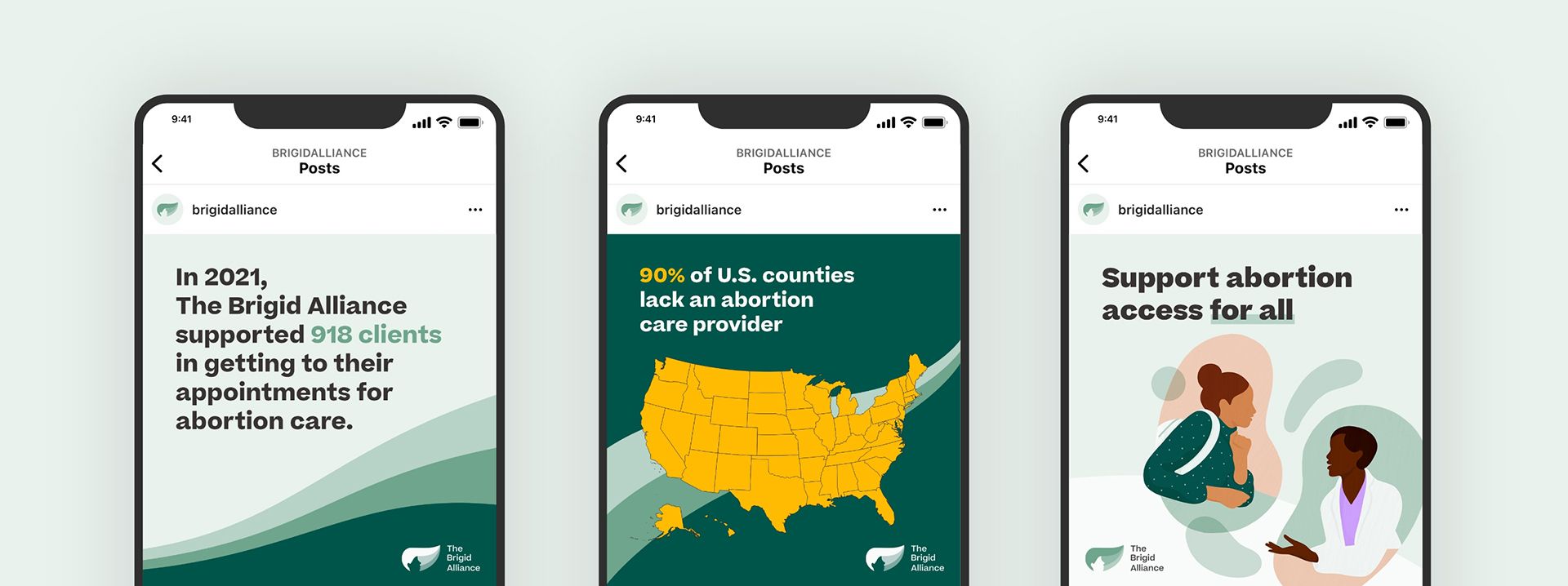
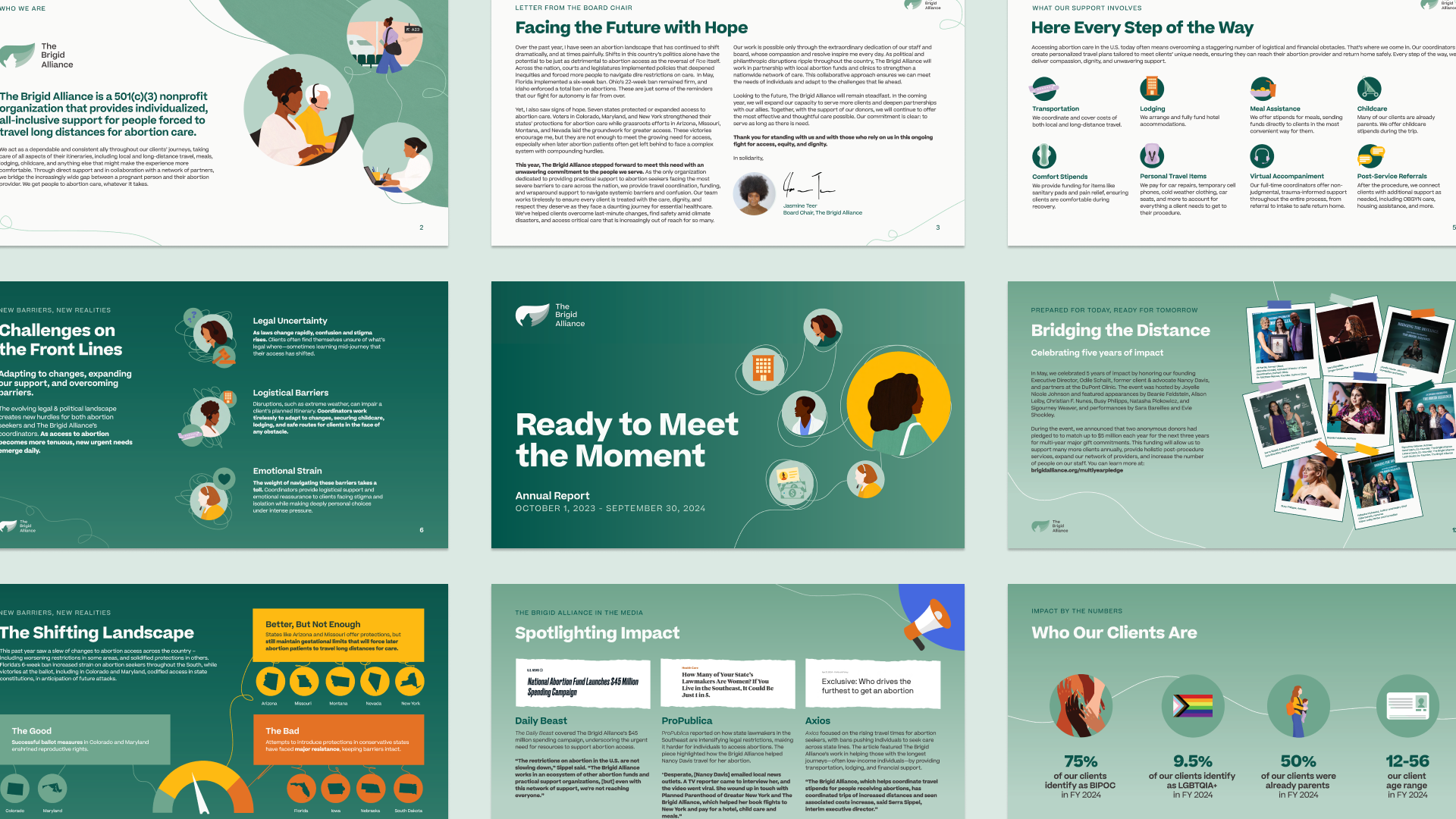
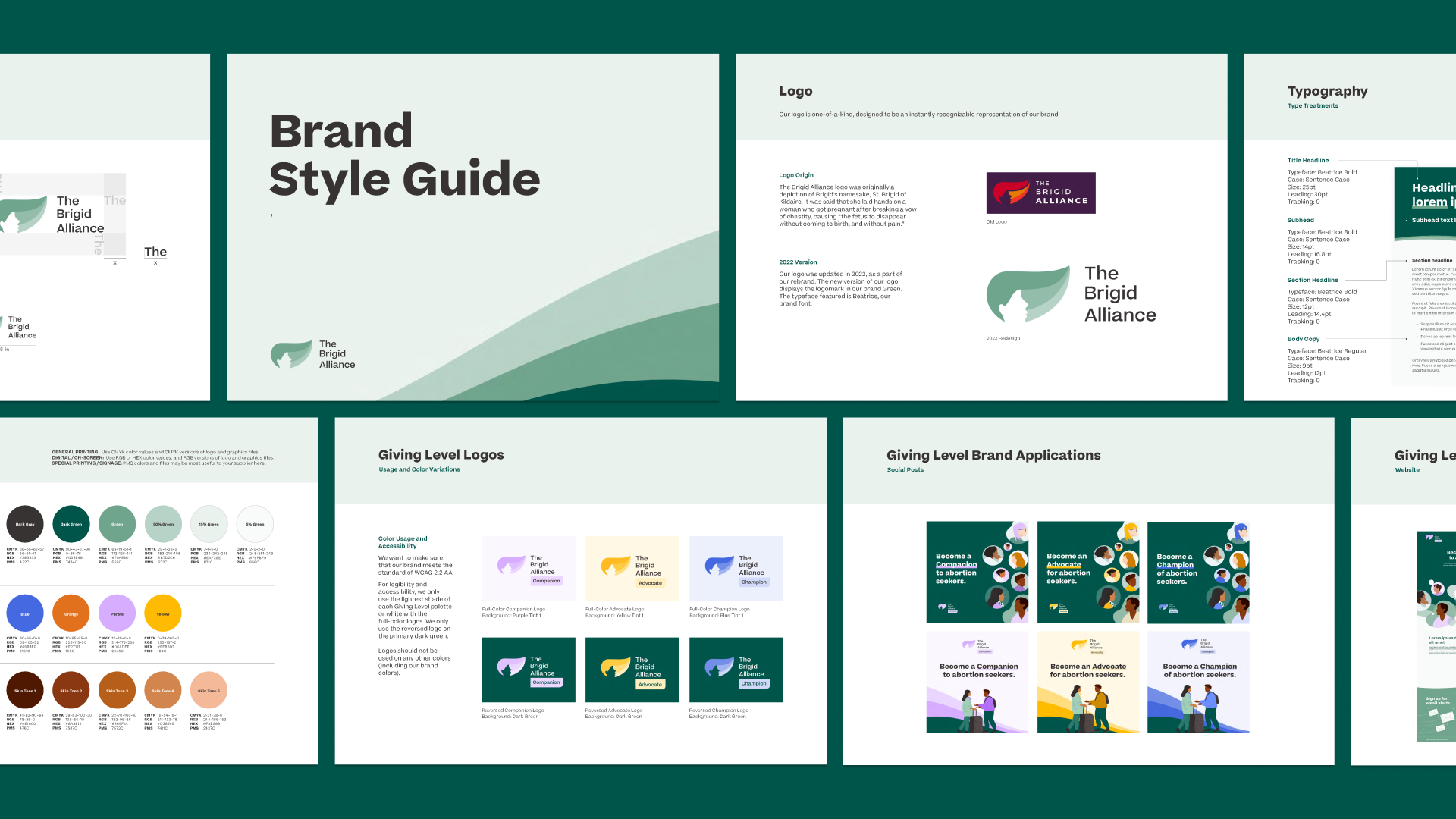
The overturning of Roe vs. Wade coincided with a new brand and website for Brigid. We developed a calm, reassuring, inviting identity and web experience, with illustrations solving practical issues of telling intensely personal stories, without revealing identities.
The new brand was immediately elevated by press coverage and celebrity endorsements, creating a spike in Search and year-end giving. But engagement was temporary. The next End of Year campaign would need to take a very different approach.
Project Snapshot
- Industry
Non-profit - Category
Healthcare - Services
Brand Strategy, Brand Identity, Web Design And Development, Go-to-market Strategy And Activation - Awards
3
FWD Thinking in Action
Make it real and keep it relevant.
Bring home the reality of an abortion journey across state lines, keep attacks on abortion access front of mind, and make donations feel tangible.
ABOUT THE WORK
Momentum without media moments
We removed dependence on external factors like media coverage. While attention waned, the need for services was increasing and we knew it wasn’t enough to simply explain how Brigid supports service users. We needed to continuously build a case and remind potential donors about ongoing attacks on abortion access.
Bringing it close to home
To maintain relevance and keep the issue front of mind with the public, we stayed closely tuned to regional developments. As restrictions or bans rolled out, we targeted regional prospects with localized creative.
Creating urgency
A Display campaign pitted brand messaging against impact framing, exceeding the industry CTR benchmark by over 40%, and building an engaged pool of potential supporters to retarget. Here, we pivoted to a donation-driving conversion campaign.
Testing every touchpoint
We developed a responsive, adaptable, always-on strategy for paid media and search, continuously testing messaging and channels to drive donations. We constantly tested the success messaging too, evaluating elements like monthly vs one-off donations, price-points vs personal stories, and in-platform sign-ups vs long-scroll experiences.
Shorter journeys aren't always better
Crafting a novel, immersive web experience, we nurtured awareness and consideration in the build up to End of Year. While it was more cost effective to secure a lead via an in-platform Meta form, with its shorter path to conversion and a lower cost per acquisition, taking people to Brigid’s website to learn about their part in the solution nurtured stronger donation rates.
Results
133% growth in EOY income.
$92.2K raised. Outperforming Giving Tuesday ROAS by 10x and doubling Brigid’s Paid Media income from 2022, even without a media moment to rely on.
8.9 ROAS
1,000+ leads
200+ donations


